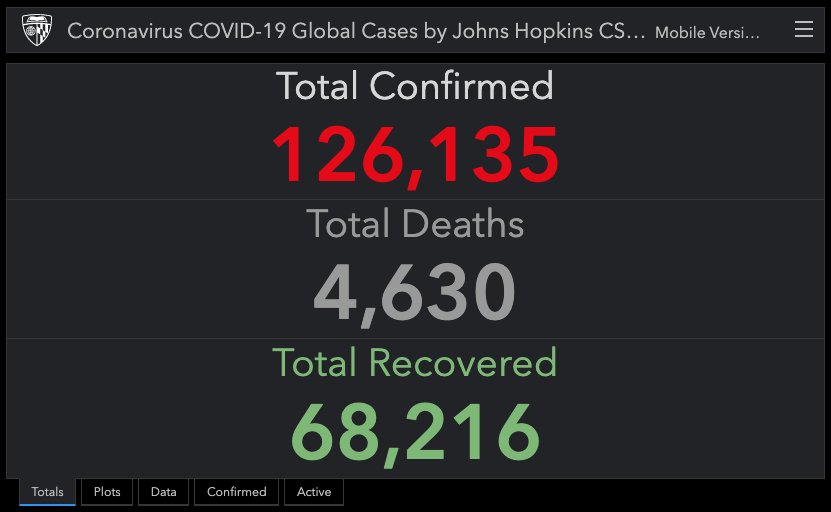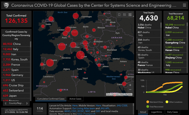
Coronavirus is all the news all the time. It can be very exhausting trying to chase down all the graphs, charts, maps and details of the virus and where it’s spreading. If you’re looking for a solid, interactive map and dashboard to download, check out what Johns Hopkins has created in this effective coronavirus global map.
The University is tracking the COVID-19 spread in real-time in their interactive dashboard with data available for download. They are also modeling the spread of the virus. Preliminary study results are discussed on their blog.